Improving CMS Website Accessibility
Learn some tips for making your site more accessible.
Creating an accessible website is an ongoing process. The goal is to improve the user experience for everyone. The tools we have available will evolve over time, as will the best practices of how to implement them.
The following tips are a starting point for improving your CMS site's accessibility. For insights that are specific to your site, we encourage you to use Siteimprove and check your accessibility score regularly.
Accessibility Guidelines
University of California policy requires compliance with the WCAG 2.0 level AA standards for all web-based information. UC San Diego websites, email campaigns, apps and social media must be in compliance with DOJ accessibility guidelines by April 2026.
Types of issues
For CMS sites, accessibility issues can be grouped into two types: template-level issues and content issues.
Template-level issues include things that the general CMS user can't edit. The page header and footer, module formatting, etc. Learn about how we manage template-level issues in the CMS and see which issues require a site republish.
Content issues arise from the text, images and other content that CMS users add to thier site. CMS site owners and editors are responsible for keeping thier site content accessible. Below are a few best practices to increase the accessibility of your CMS pages.
Siteimprove users, see our instructions for filtering Siteimprove results to show only content issues.
Links
Accessible links use descriptive link text and result in predictable behavior.
Tip: If you can understand and predict what clicking on a link will do from only the link text, then it is more likely to be an accessible link.
Descriptive link text
Do: Use unique and informative link text that doesn't rely on words outside of the link for understanding.
You need to strike a balance between creating informative link text and overwhelming the user. Compare:
- Learn how to use links in the Campus CMS.
- This is a reasonable (but not the only) option.
- Learn how to use links in the Campus CMS.
- This is too much. While it is maximally informative link text, it is difficult to quickly pick out what the link is (and may be burdensome for screen reader users). This is similar to the idea 'if everything is highlighted, then nothing is highlighted.'
Don't: Use vague wording or repeat link text on a page.
- Never create links with the text "click here" or "more"; ADA compliance requires that links provide clear information about where the link will take the user. This aids those who use a screen reader.
- Don't repeat link text that will lead to different locations ("read more" and "learn more" are common culprits).
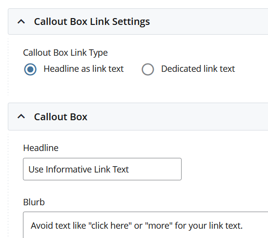
Note: If you are using the Callout Content or News With Images modules, you can now choose the "Headline as link text" option to help you avoid uninformative repeating link text.
Don't: Be overly technical in your link text.
Avoid using URLs for link text. Screen readers will read out the entire URL ('h t t p colon ...'). Also, URLs are often not easy to understand compared to plain text. Compare:
Predictable behavior
Do: Include file names and login requirements in the link text if applicable. Users should not be surprised if a link starts a file download or requests validation information. A security-minded user may back out of your site for unpredictable behavior.
- Make sure that links to files include information about the file type, e.g., Academic Calendar (PDF).
- Make sure that links to login pages are clearly identified, e.g., JDOnline (login required).
Don't: Force a link to open in a new tab or window.
Don't: Underline text that isn't a link.
Link text is underlined by default. If you have other underlined text on your page, users will expect it to be a link and may become frustrated when it isn't. They may think that your page is broken. Instead of underlining, use bold.
Images
Accessible images have descriptive alternative text and load quickly on all devices.
Use images to supplement the text on your page - not to replace it.
Tip: If you can still understand the page's content without the images, then you aren't depending on them for conveying information.
Descriptive alternative text
Alternative text for images is required by the ADA. It is also helpful for search engines, which otherwise don't know what images on your page represent.
Avoid images that are primarily text.
Do: Describe the image well. Whatever is relevant for a sighted user should be included in the alternative text.
- OK alternative text: Students smiling
- Better alternative text: Smiling students in caps and gowns celebrating 2023 Commencement
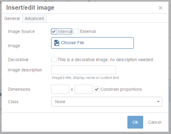
Use the Image Description field in the CMS to add your alternative text:

See Working with Images for more details.
Don't: Use the image's filename as the alternative text.
Much like link text, alternative text should be easily understood by a human, not a set of arbitrary characters, or even semi-descriptive file names that may be spelled out (ex: commencement-2024.png)
Don't: Mark something as 'decorative image' unless it adds no information to the page. An example of an appropriate decorative image could be an abstract design meant to visually break up sections of the page.
Load quickly
When you have images in the CMS, users' web browsers will download the entire full-size image. Then the browser will size the image to fit on the page. If the full-size image is larger than the display size, the page loads slower than necessary.
Do: Upload properly sized images to the CMS.
Some guidelines on image sizes:
- The hero section (full screen width) is 1440 pixels wide.
- The usable space on most pages (to the right of the left navigation) is 900 pixels wide.
- Profile images used for profile templates are 198 pixels wide.
Use a desktop image program to size images appropriately before you upload them to the CMS.
Do: Resize existing images to the proper size in the CMS.
If large images are already in the CMS, you can resize them.
Headings
Accessible headings clearly express a topic and reflect page structure.
Tip: Your headings should act like an outline of your content.
More on headings in the CMS.
H1 is your page topic
Do: Start every page with an H1 heading. The heading should be short, but accurately describe your page. Each page on your site should have a unique H1 heading.
Don't: Use multiple H1 headings on a page.
Each page should have exactly one H1 heading.
Don't: Use a banner image instead of an H1 heading. Images are not always visible, and even when they are, can't be difficult to read depending on the design.
Text is more legible than an image.
Don't: Use a module's heading instead of adding an H1 heading to the page. Modules are designed to be part of a page, not the entirety of a page. The module's heading is an H2, not an H1.
You still need an H1 even if the rest of your page content is only one module.
Page structure
Just like your website has a structure of pages (a homepage, folders with content in them, possibly including further folders), individual pages have structure as well.
The page may be simple, and just have an H1 heading with a small amount of content, or it may have multiple subheadings.
To preserve a good information structure -
Do: Use headings organizationally like an outline. While you wouldn't combine headings with a bulleted list, it can help to think of them that way as a visualization. For example:
- Heading 1
- Heading 2
- Heading 2
- Heading 3
- Heading 4
- Heading 4
- Heading 3
- Heading 3
- Heading 2
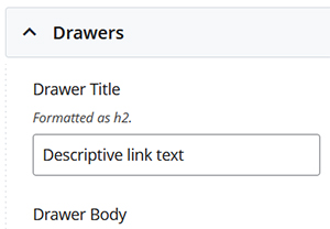
Do: Check for built-in headings. Some CMS templates and module automatically format text as certain heading levels. Take this into consideration when planning your other headings. We have added hint text to indicate when text will be formatted as a heading. For example:

Don't: Skip heading levels. Headings provide organizational structure to screen readers an search engines. Skipping levels breaks the structure and makes your page more difficult to parse.