Blink Gets a Refresh!
Blink, the campus staff website, updated to provide easier search and content features.
By Douglas Bonilla, Communication Specialist

Many may not realize it but Blink, the most frequently visited site on campus, up until last week had achieved the rare feat of being stood up for nearly two decades - not an easy feat for any technology. According to the Web Content Management System team of Workplace Technology Services, Blink largely remained the same since its inception in 2000 with only a few changes in that time.
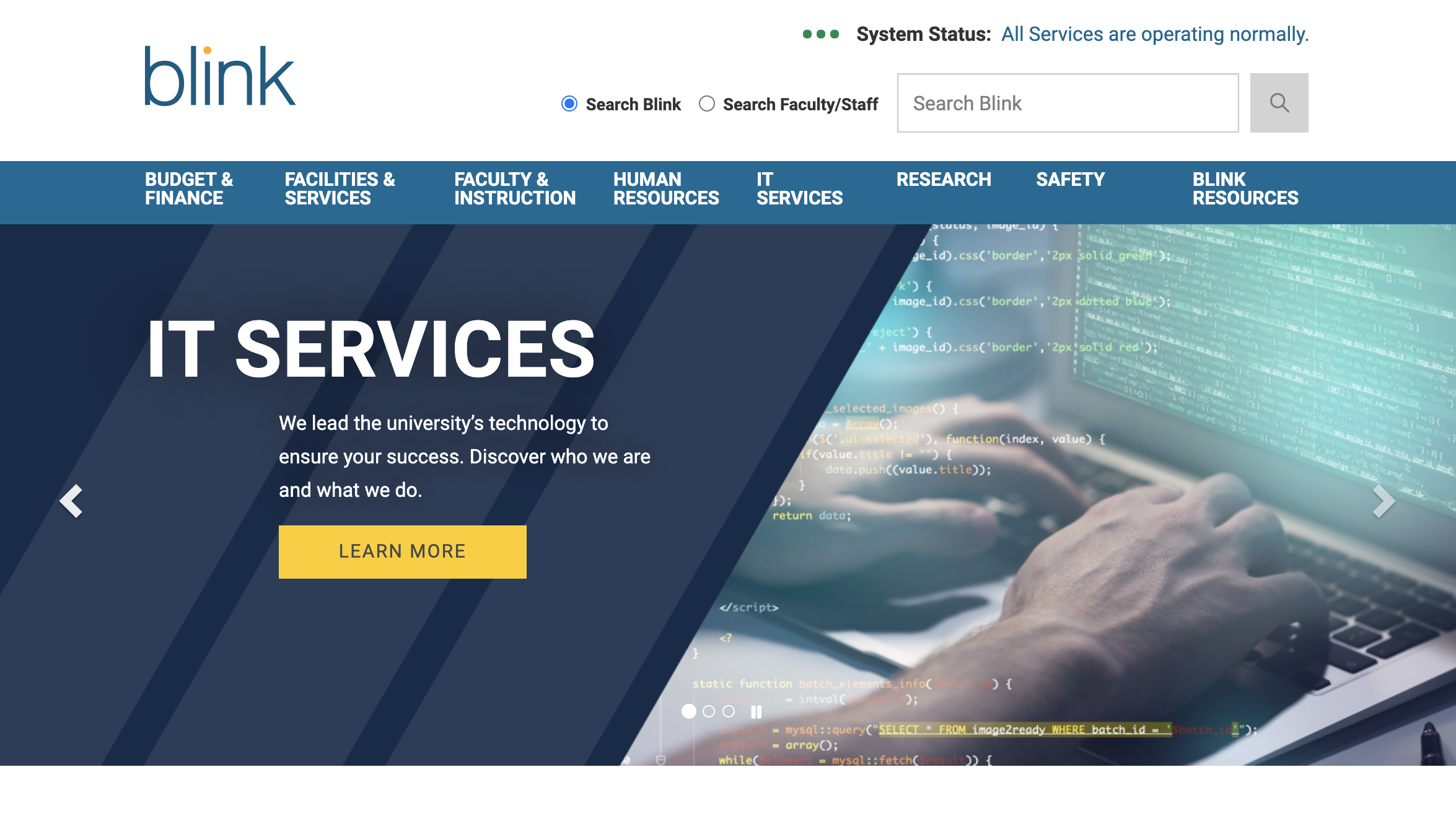
What we now see in Blink, as of August 7, 2020, is a more refined, streamlined and friendly user experience for navigating the existing and highly expansive content on there. What was once a grand repository for everything UC San Diego, things are now cleaner and easier to find. What exactly changed?
The first thing folks will notice is a new homepage, which offers a simplified, yet elegant design for presenting critical information. This homepage also features prominent links to search, tools and resources to help folks find what they are looking for. After all, Blink is itself a resource and tool to do your job better. Many of the changes made were to reinforce this purpose across the entirety of the revamp.
A new and improved search was implemented prior to launch, although in conjunction with the other changes, this makes for a vast improvement over how searches felt before. You will generally get what you want within that first click.
A new top navigation bar was incorporated to provide quicker links to critical content and departmental information. After all, important content isn’t very useful if it can’t be easily found.
Page templates were also upgraded, giving Blink not only a fresher look and feel, but a functionality that could only be found in newer UC San Diego websites. Now, those managing the content will have access to the same graphic-rich modules to continually up what they deliver to site visitors.
“The launch of our new Blink site is a tremendous achievement," said Allisa Becker, manager of web content and case management. "I really want to thank our team for making it happen and the content editors across campus who provided input. New Blink is designed to help employees find information they need when they need it, and provide a much richer user experience. And it only gets better from here as we continue to improve upon the site."
As to what’s next, there will be a dedicated focus on the latest news and event information plus an archive, as well as a much-needed centralized process for mandatory content reviews to ensure a seamless and profound information experience for site visitors.
See for yourself... Visit Blink today!