Research-Based Presentation Design Guidelines
Effective multimedia design is based on what we know about cognitive psychology. If you use visual aids like PowerPoint in your course videos, read the tips below.
 Just about everyone has suffered “Death by PowerPoint”: being forced to endure a presentation with such poorly-designed visuals and boorish narration that viewers don’t pay attention or retain much of value. While this slightly facetious phenomenon is most often considered in a corporate context, the same applies to visual materials used in higher education. If you're an instructor using visual aids in your videos, it's essential to design them with an understanding of how we learn through multimedia.
This guide leverages relevant cognitive psychology research (discussed in our other article "Multimedia Learning Principles") to provide specific, evidence-based recommendations for designing and delivering effective presentations. But your PowerPoint deck is only one part of your "educational performance," which, broadly speaking, is a fusion of pictures, text, and spoken words. To maximize learners' engagement, retention, and transfer of the material, all three elements must be strategically deployed.
This guide relies heavily on Richard Mayer's Multimedia Learning and Stephen Kosslyn's Clear and to the Point: 8 Psychological Principles for Compelling PowerPoint Presentations. Both authors apply similar foundations in cognitive psychology to generate best practices for designing effective multimedia learning materials.
We hope this guide will be particularly helpful to instructors creating lecture videos but should prove useful to those delivering synchronous or in-person presentations.
The Short Version
- Use images instead of text when possible.
- Use high-resolution, royalty-free images.
- Use no more than 4 bullets per slide.
- Make objects appear only when mentioned.
- Dim objects after they're discussed.
- Draw attention to salient information.
- Avoid using decorative images.
- When distributing, add alt text to images.
Use images instead of text when possible.
Based on his experiments investigating the efficacy of multimedia messages, Richard Mayer defines what he calls the Redundancy Principle: "People learn better from graphics and narration than from graphics, narration, and printed text" (118). Duplicative images and onscreen text lead to extraneous cognitive processing by learners both because they have more to look at onscreen and because they'll spend unconscious effort trying to compare what they're hearing and what they're seeing.
So what comes from Mayer appears to be a suggestion to use either an image OR words, but not both (though labels are fine if they're important). But we also know from neurological research that images and words end up getting encoded in different places in the brain, and that encoding imagery uses less cognitive effort than encoding words (Grady et al, 2706). (This is probably an evolutionary phenomenon, given the importance of retaining visual information in one's immediate environment.) So in some ways, research has proved that a picture really can be worth a thousand words.
What this boils down to is if you have an image that can represent your material, use that image exclusively on your slide and remove any text that might accompany it unless it's necessary for your students' understanding. It'll be "stickier" in the students' minds.
The bottom line: If an image can represent your slide content, use it exclusively on your slide without any onscreen text.
Use high-resolution, royalty-free images.
When using images, try to find the highest resolution you can. "Resolution" refers to the number of pixels that comprise the image. The more pixels there are, the more quality - and the greater the file size.
You can always shrink an image without reducing its quality, but don't increase its size over 100% or the original. If you do, the quality of the image will visibly decrease as it pixelates, which can either make it more difficult to understand or even unconsciously communicate "low quality" to your viewers!
In addition, when recording videos you should be particularly careful about using copyrighted images in your visual aids. While most course materials aren't public, Fair Use doesn't provide instructors with blanket protection from infringement and it's possible your video could get out. Try to use royalty-free image sites (such as Pixabay) to find an image that could work for you. You could also leverage the surprisingly robust features of your presentation software to design your own images, even by piecing together shapes. (Note that all of the imagery in this article was created using royalty-free images and PowerPoint.)
If it's truly necessary to use a copyrighted image in your slide, you should attempt to contact the publisher to obtain the appropriate permissions. If you find images under a Creative Commons license, be sure to abide by the license and cite appropriately.
The bottom line: Use high-resolution images if possible, and don't enlarge them above 100% of their original size. Use royalty-free imagery, attribute appropriately, or create your own images if needed.
Use no more than 4 bullets per slide.
If you've ever suffered from "Death by PowerPoint," you've probably experienced slides crammed full of text: sub-sub-bullets, complete sentences, entire paragraphs, or worse. This is most often the result of instructors using visual presentations as memory aids rather than as instructional tools for learners. We've all heard about the value of taking a student-centered approach to pedagogy; presentation design can embody that methodology.
With respect to determining how much text is appropriate, there are several cognitive psychology principles at work. As we discussed in our Multimedia Learning Principles article, we have two channels for processing a multimedia message. When presented with a large amount of text, the visual channel is oversaturated, and learners' verbal channels struggle to attend effectively to your words as they try to read what's on screen. They also spend cognitive effort comparing the printed and spoken words.
Also in our article on Multimedia Learning Principles, we discussed what occurs during active processing as well as the various types of cognitive load that learners experience. Given that active learning first necessitates the selection of relevant information from an instructional message, providing succinct text will help reduce students' germane load since you're doing some of the selection work for them.
So now that we know why less text is important, is it possible to quantify a recommendation?
A variety of studies have shown that humans can reliably retain 4 concepts in working memory - the so-called "rule of four." The brain can "chunk" information to improve retention, however, so each of these 4 concepts can have up to 4 component pieces of information.
To see the rule of four and chunking principles in effect, check out the video below.
So - we can retain information better when there are four or fewer units, and using recognizable groupings of more than four units helps to improve retention. With all of this in mind, a good rule of thumb is to try to restrict yourself to four or fewer bullets per slide, with four or fewer units of information contained within each bullet.
One way to quantify these "units" of information is to count the number of verbs and nouns (Kosslyn, 77). For example, the phrase "Use four bullets per slide" has 3 units of information: "use," "bullets," and "slide."
Another way to think about this: just use less text in your slides. It may not always be possible, but can be an important goal for which to strive, especially if it helps you break your presentation into more slides. Ultimately, though, remember that your visual aid is intended for your students - not to help you remember what you need to discuss. If possible (or if necessary), use your presentation software's "notes" feature to make sure you don't forget to discuss anything.
Remember what we discussed earlier, though: images tend to be "stickier" than words in long-term memory. If you can find a meaningful image that can replace some or all of the text on your slide, use that instead (using labels as needed, of course).
The bottom line: Try to use four or fewer bullets on a slide, each with four or fewer concepts. Favor images over text whenever appropriate.
Make objects appear only when mentioned.
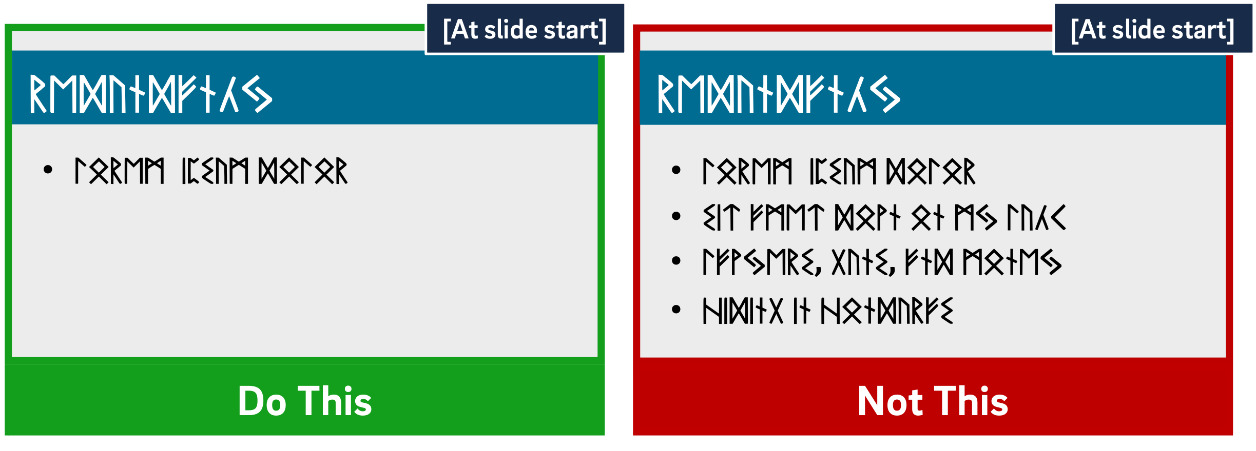
Mayer's multimedia messaging experiments led him to what he termed the Temporal Contiguity Principle: "Students learn better when corresponding words and pictures are presented simultaneously rather than successively" (153). Mayer discusses this principle largely in the context of whether to present narration after or during a corresponding animation. While common sense might suggest that encountering the information twice in succession (in two different forms) would lead to better transfer and retention, it was instead when the narration and animation were presented simultaneously.
Now, chances are that you're not planning on narrating over a series of silent animated movies as your presentation - but it's important to remember that presentation software is, in and of itself, a kind of animation tool. Moving to a new slide is essentially a simple animation.
But in the context of the Temporal Contiguity Principle, think about a learner arriving on a slide that already has all of its visual content present at the start. With so much information for your learners to look at, you risk cognitive overload as they read the entire slide - including all the parts that may not yet be relevant or comprehensible - while also trying to process your spoken words.
Building your bullets and images one at a time provides visual cues to your learners about where you are in the presentation and what's relevant to the current moment of knowledge construction. Making clear what specific visual elements are related to what's being discussed maximizes your learners' ability to integrate what they see and what they hear simultaneously.
So, add simple animations to your slides. Leverage build-ins or entrance effects to have objects appear on your slide only when you mention them - bullets, images, graphs, shapes - anything. Stick to subtle effects like fade-ins or even just appearing unless a particular animation offers additional impact to your message.
The bottom line: Make objects appear only when you discuss them.
Dim objects after they're discussed.
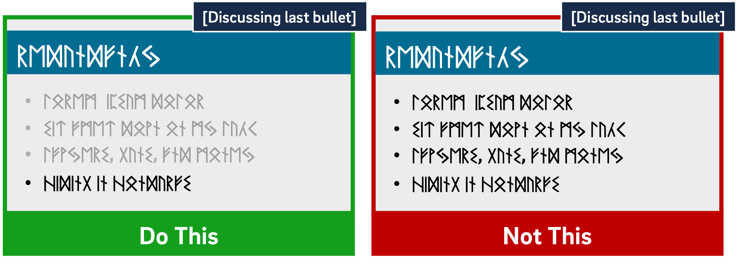
As we discussed earlier, Mayer's Temporal Contiguity Principle implies that we should make information appear only when mentioned. Well, the converse is true as well: information that's already been discussed should be visually de-emphasized. In reinforcing where exactly you are within the visual information on your slide, you're reducing your learners' cognitive load by encouraging them to focus their efforts on a smaller set of visual information while also maintaining the conceptual connection with the previous information.
In his book providing detailed presentation design guidelines based on a similar set of cognitive psychology principles as Mayer, Stephen Kosslyn identifies seven high-level principles, one of which is the Principle of Salience: "Attention is drawn to large perceptible differences" (7). Given that our brains are wired to notice strong differences in contrast (such as this bold text), de-emphasizing past information provides a cue to learners that you're moving on to other visual information on the slide and helps direct their attention appropriately.
You can de-emphasize objects onscreen by adding an "emphasis" (PowerPoint) or "action" (Keynote) animation to a bullet, such as reducing the opacity of the object to 25% (or increasing its transparency to 75%). Add the animation at the same time a new object appears.
The bottom line: Visually de-emphasize items that have already been discussed.
Draw attention to salient information.
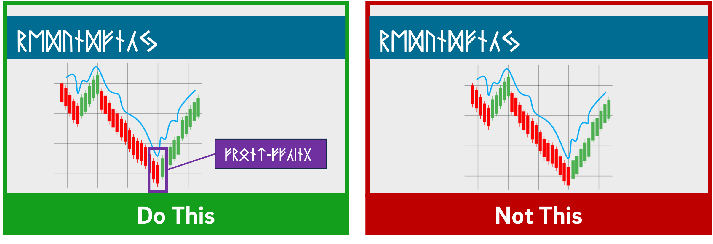
The Signaling Principle indicates that "People learn better when cues that highlight the organization of the essential material are added" (Mayer, 108). These cues, Mayer writes, "are intended to guide learners' attention to essential material and to guide learners' organization of the essential material into a coherent structure" (117). Leveraging what we discussed in our article about multimedia learning, signaling can reduce extraneous load, foster germane load, and assist with the selection and organization of materials that must occur during active learning.
While these cues can be verbal (such as explicitly stating where you are in your presentation based on an outline you presented at the start) the visual cues within your presentation play an extremely strong role in facilitating your students' understanding. For example, if you present a complex graph, do something either when designing your presentation (e.g. add arrows, labels, zoom in, etc.) or during your presentation (e.g. use your mouse as a pointer) to draw your learners' attention to the most important or relevant pieces of information.
While making objects appear and dim at the appropriate times highlights salient information as well, for more complex images it's important to draw learners' attention to the most relevant parts. As is often the case in effective presentation design, this helps reduce learners' extraneous load when presented with a surfeit of visual information.
The bottom line: design your slides with arrows, circles, or other visual cues that draw viewers' attention to particularly important details. Failing that, leverage pointers or other indicators during your recording.
Avoid using decorative images.
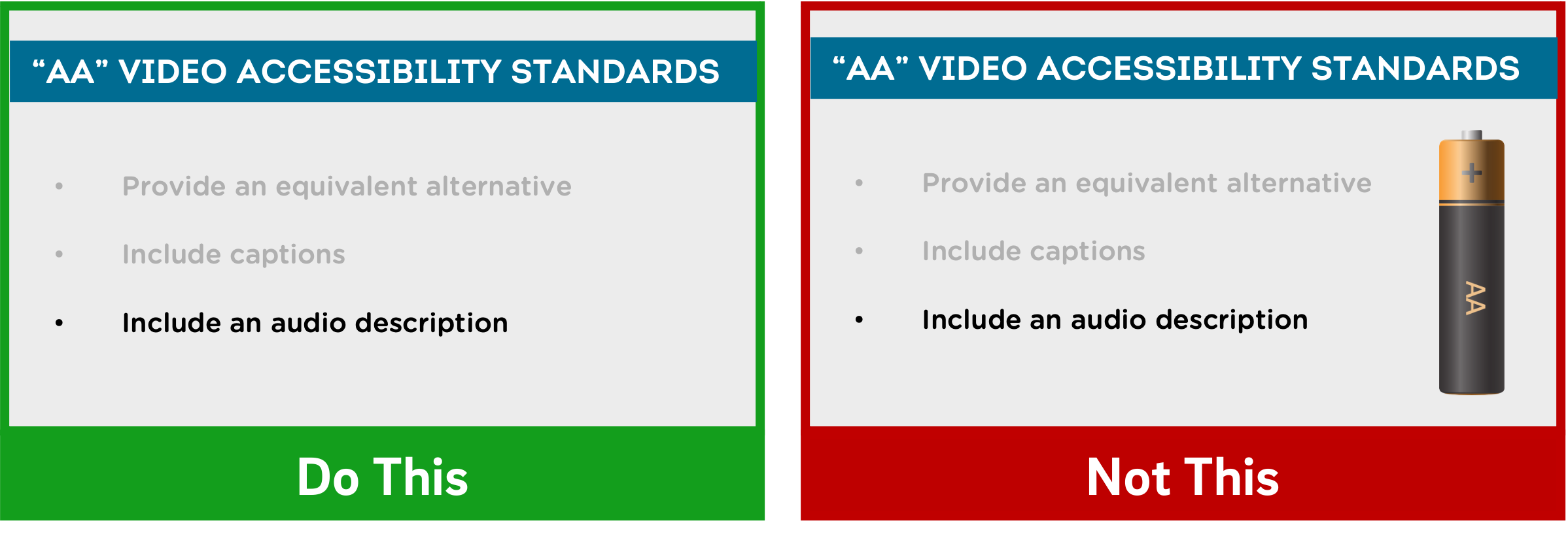
Richard Mayer identifies three main categories of images that are helpful to learners: representational images, which portray an individual object; organizational images, which illustrate relationships between objects (or between parts of an object); and explanative images, which illustrate how a system works (236).
Decorative images, on the other hand, are "illustrations that are intended to interest the reader but that do not enhance the message of the passage" (Mayer, 236). They distract students from learning goals, add to their extraneous load, and squander their limited cognitive resources.
Now, on the surface, it may seem like adding some decorative imagery to your more text-heavy slides might be a good thing, to give them some visual interest and foster a little more engagement with your presentation. As Mayer points out, this is arousal theory: "the idea that students learn better when they are emotionally aroused by the material" (93). Unfortunately, decorative images end up becoming "seductive illustrations": images added solely to add some visual interest. Unfortunately research has confirmed that these details are retained better than the presentation's central points (Mayer, 97).
So, if an image - indeed, if any content - doesn't directly support the completion of your students' learning objectives, don't include it. While we do recommend using images instead of text when possible as well as using less text overall, don't include imagery for imagery's sake.
Remember - an effective multimedia message should be designed to create the conditions for maximal learning. Some of your slides may end up being less visually interesting, but especially when paired with our other tips, you'll be helping your learners spend their cognitive resources more effectively.
The bottom line: Don't add images that don't directly support your students' learning.
When distributing, add alt text to images.
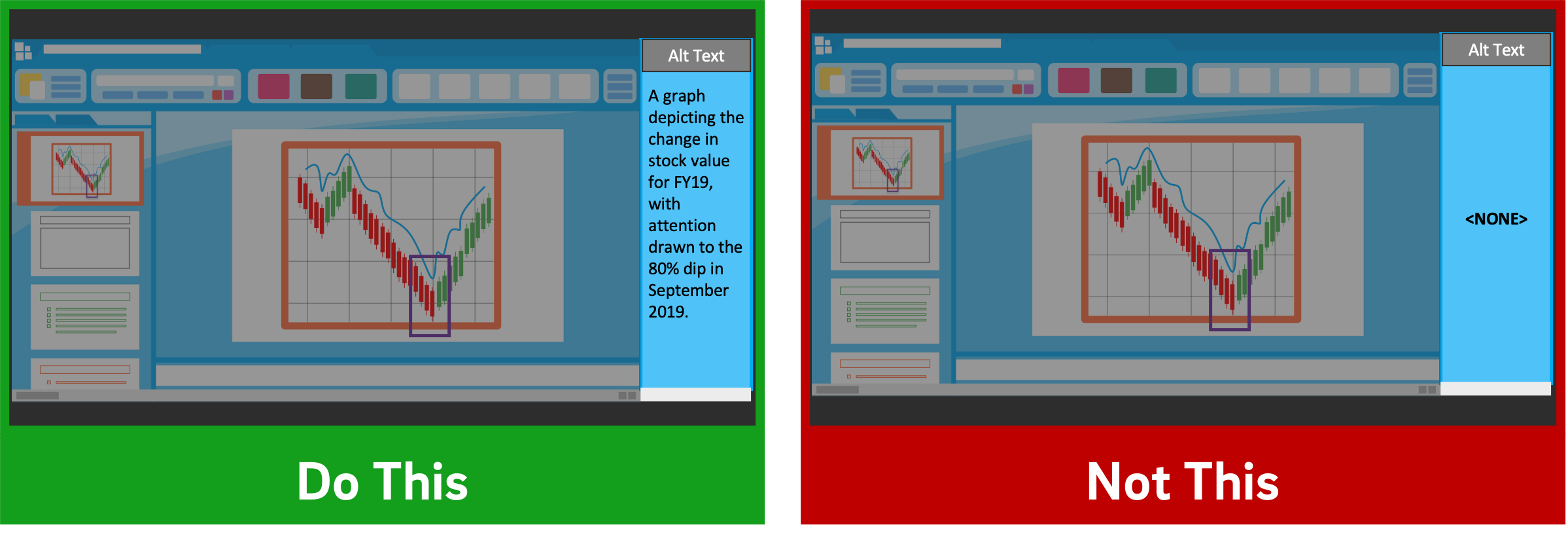
Given how deleterious decorative imagery can be to our cognitive resources, all the images you've included in your presentation should support your students' learning. If there are students who can't perceive that visual content, however, their learning is compromised compared to their classmates.
If you intend to distribute your presentation file digitally (for example, uploading it to your LMS for students to download), you should ensure that all the images included in the presentation have what's called "alt text": text-based metadata embedded into the image that displays onscreen when the image fails to load and that describes it for screen reader software. These image descriptions are essential in ensuring that your materials are accessible to learners with visual disabilities.
Adding alt text within many applications is often just a matter of right-clicking an image, clicking the appropriate menu option, and typing in a description. A good alt tag should be specific and concise. And while it should communicate the relevant part(s) of the image, it shouldn't require the learner to listen to a lengthy description.
The bottom line: Add alt tags to all images in presentations you intend to distribute digitally.
PowerPoint shouldn't be vilified or glorified. Presentation software is just a tool, and it could be used effectively or poorly to communicate a message. Kosslyn sums it up well in his book Clear and to the Point: "PowerPoint presentations can help people understand by making both memory and processing easier for them" (12).
It is true that presentations designed this way require more effort to produce. If you're struggling to devote the time needed in pre-production to make your slides more pedagogically effective, some low-hanging fruit you can bite off (so to speak) is to use tools during your presentation to draw your students' attention, such as turning your mouse cursor into a laser pointer. Let Kosslyn's principles of Salience and Discriminability remind you that "attention is drawn to large perceptible differences," and those differences "must differ by a large enough proportion or they will not be distinguished" (7-8).
It's important to note that if you abide by these research-based best practices, it's likely that your presentation won't work as effectively as a standalone artifact. It's not meant to. Your slide deck is part of a larger presentation that includes pictures, text, and spoken words, all employed strategically to maximize learning. If it's important that your presentation be legible on its own, consider developing an alternate version.
References
Fiorella, L., Stull, A. T., Kuhlmann, S., & Mayer, R. E. (2019). Instructor presence in video lectures: The role of dynamic drawings, eye contact, and instructor visibility. Journal of Educational Psychology, 111(7), 1162–1171. https://doi.org/10.1037/edu0000325
Grady, C. L., McIntosh, A. R., Rajah, M. N., & Craik, F. I. M. (1998). Neural correlates of the episodic encoding of pictures and words. Proc. Natl. Acad. Sci. USA, 95, 2703–2708.
Kosslyn, S. (2007). Clear and to the point: 8 psychological principles for compelling PowerPoint presentations. New York: Oxford University Press.
Mayer, R. E. (2009). Multimedia learning (2nd ed.). Cambridge, England: Cambridge University Press.
Interested in consulting with a member of the Multimedia Services team? Contact us at multimedia@ucsd.edu.