CMS: Kitchen Sink
For advanced users, see a list of pre-canned CMS styles and their corresponding HTML code.
Table of Contents
Most of these styles require you to work in HTML code mode but some are available via the WYSIWYG editor.
CSS layouts
The 2 and 3-column CSS layouts provide a way to lay out your text without using a table.
2-column layout:
Column 1 header
Lorem ipsum dolor sit amet, consectetur adipisicing elit, sed do eiusmod tempor incididunt ut labore et dolore magna aliqua. Ut enim ad minim veniam, quis nostrud exercitation ullamco laboris nisi ut aliquip ex ea commodo consequat. Duis aute irure dolor in reprehenderit in voluptate velit esse cillum dolore eu fugiat nulla pariatur. Excepteur sint occaecat cupidatat non proident, sunt in culpa qui officia deserunt mollit anim id est laborum.
Column 2 header
Lorem ipsum dolor sit amet, consectetur adipisicing elit, sed do eiusmod tempor incididunt ut labore et dolore magna aliqua. Ut enim ad minim veniam, quis nostrud exercitation ullamco laboris nisi ut aliquip ex ea commodo consequat. Duis aute irure dolor in reprehenderit in voluptate velit esse cillum dolore eu fugiat nulla pariatur. Excepteur sint occaecat cupidatat non proident, sunt in culpa qui officia deserunt mollit anim id est laborum.
<div class="row">
    <div class="col-md-6">
        <h3 class="header">Header 1 Column</h3>
        <p>
            Lorem ipsum dolor sit amet, consectetur adipisicing elit, sed do eiusmod tempor incididunt ut labore et dolore magna aliqua. Ut enim ad minim veniam, quis nostrud exercitation ullamco laboris nisi ut aliquip ex ea commodo consequat. Duis aute irure dolor in reprehenderit in voluptate velit esse cillum dolore eu fugiat nulla pariatur. Excepteur sint occaecat cupidatat non proident, sunt in culpa qui officia deserunt mollit anim id est laborum.
        </p>
    </div>

    <div class="col-md-6">
        <h3 class="header">Header 2 Column</h3>
        <p>
            Lorem ipsum dolor sit amet, consectetur adipisicing elit, sed do eiusmod tempor incididunt ut labore et dolore magna aliqua. Ut enim ad minim veniam, quis nostrud exercitation ullamco laboris nisi ut aliquip ex ea commodo consequat. Duis aute irure dolor in reprehenderit in voluptate velit esse cillum dolore eu fugiat nulla pariatur. Excepteur sint occaecat cupidatat non proident, sunt in culpa qui officia deserunt mollit anim id est laborum.
        </p>
    </div>
</div>
3-column layout:
Column 1 header
Lorem ipsum dolor sit amet, consectetur adipisicing elit, sed do eiusmod tempor incididunt ut labore et dolore magna aliqua. Ut enim ad minim veniam, quis nostrud exercitation ullamco laboris nisi ut aliquip ex ea commodo consequat. Duis aute irure dolor in reprehenderit in voluptate velit esse cillum dolore eu fugiat nulla pariatur. Excepteur sint occaecat cupidatat non proident, sunt in culpa qui officia deserunt mollit anim id est laborum.
Column 2 header
Lorem ipsum dolor sit amet, consectetur adipisicing elit, sed do eiusmod tempor incididunt ut labore et dolore magna aliqua. Ut enim ad minim veniam, quis nostrud exercitation ullamco laboris nisi ut aliquip ex ea commodo consequat. Duis aute irure dolor in reprehenderit in voluptate velit esse cillum dolore eu fugiat nulla pariatur. Excepteur sint occaecat cupidatat non proident, sunt in culpa qui officia deserunt mollit anim id est laborum.
Column 3 header
Lorem ipsum dolor sit amet, consectetur adipisicing elit, sed do eiusmod tempor incididunt ut labore et dolore magna aliqua. Ut enim ad minim veniam, quis nostrud exercitation ullamco laboris nisi ut aliquip ex ea commodo consequat. Duis aute irure dolor in reprehenderit in voluptate velit esse cillum dolore eu fugiat nulla pariatur. Excepteur sint occaecat cupidatat non proident, sunt in culpa qui officia deserunt mollit anim id est laborum.
<div class="row">
    <div class="col-md-4">
        <h3 class="header">Header 1 Column</h3>
        <p>
            Lorem ipsum dolor sit amet, consectetur adipisicing elit, sed do eiusmod tempor incididunt ut labore et dolore magna aliqua. Ut enim ad minim veniam, quis nostrud exercitation ullamco laboris nisi ut aliquip ex ea commodo consequat. Duis aute irure dolor in reprehenderit in voluptate velit esse cillum dolore eu fugiat nulla pariatur. Excepteur sint occaecat cupidatat non proident, sunt in culpa qui officia deserunt mollit anim id est laborum.
        </p>
     </div>

    <div class="col-md-4 col">
        <h3 class="header">Header 2 Column</h3>
        <p>
            Lorem ipsum dolor sit amet, consectetur adipisicing elit, sed do eiusmod tempor incididunt ut labore et dolore magna aliqua. Ut enim ad minim veniam, quis nostrud exercitation ullamco laboris nisi ut aliquip ex ea commodo consequat. Duis aute irure dolor in reprehenderit in voluptate velit esse cillum dolore eu fugiat nulla pariatur. Excepteur sint occaecat cupidatat non proident, sunt in culpa qui officia deserunt mollit anim id est laborum.
        </p>
    </div>

    <div class="col-md-4 col">
        <h3 class="header">Header 3 Column</h3>
        <p>
            Lorem ipsum dolor sit amet, consectetur adipisicing elit, sed do eiusmod tempor incididunt ut labore et dolore magna aliqua. Ut enim ad minim veniam, quis nostrud exercitation ullamco laboris nisi ut aliquip ex ea commodo consequat. Duis aute irure dolor in reprehenderit in voluptate velit esse cillum dolore eu fugiat nulla pariatur. Excepteur sint occaecat cupidatat non proident, sunt in culpa qui officia deserunt mollit anim id est laborum.
        </p>
    </div>
</div>
Tables
Use tables for tabular data only. For other data, use columns.
- The "styled" class takes care of the formatting for you
- Use the <th> tags to identify the Header cells
- For accessibility purposes, use the <caption> tag to identify the general table content
| Heading | Heading | Heading |
|---|---|---|
| Data 1 | Data 2 | Data 3 |
| Data 4 | Data 5 | Data 6 |
| Data 7 | Data 8 | Data 9 |
Note:
- Substituting <th> for <td> in the first row applies heading formatting
- Alternating "odd" and "even" class names on the
trelements applies alternate row "zebra" striping
<table class="styled">
    <caption>Add table description for accessibility purposes.</caption>
    <tbody>
        <tr>
            <th>Heading</th>
            <th>Heading</th>
            <th>Heading</th>
        </tr>
        <tr class="odd">
            <td>Data 1</td>
            <td>Data 2</td>
            <td>Data 3</td>
        </tr>
        <tr class="even">
            <td>Data 4</td>
            <td>Data 5</td>
            <td>Data 6</td>
        </tr>
        <tr class="odd">
            <td>Data 7</td>
            <td>Data 8</td>
            <td>Data 9</td>
        </tr>
    </tbody>
</table>
Alternative table style
Use the .table-striped class in the to add zebra-striping to table rows within the <tbody>.
| # | First Name | Last Name | Username |
|---|---|---|---|
| 1 | Mark | Otto | @mdo |
| 2 | Jacob | Thornton | @fat |
| 3 | Larry | the Bird |
<table class="table table-striped">
<caption>Add table description for accessibility purposes.</caption>
    <tbody>
        <tr>
            <th>#</th>
            <th>First Name</th>
            <th>Last Name</th>
            <th>Username</th>
        </tr>
        <tr><th scope="row">1</th>
            <td>Mark</td>
            <td>Otto</td>
            <td>@mdo</td>
        </tr>
        <tr><th scope="row">2</th>
            <td>Jacob</td>
            <td>Thornton</td>
            <td>@fat</td>
        </tr>
        <tr><th scope="row">3</th>
            <td>Larry</td>
            <td>the Bird</td>
            <td>@twitter</td>
        </tr>
    </tbody>
</table>
Clearfix example
If you notice that text isn't aligning relative to images:

You need to apply the clearfix class to the text to "clear" the image:
<div class="clearfix">
    <img alt="example" src="/_images/example.png" width="100" height="100" />
    <h3>Another Researcher</h3>
    <p>
        UC Santa Cruz<br />
        Professor<br />
        Visiting Scholar 4/1/15 - 3/31/16
    </p>
</div>
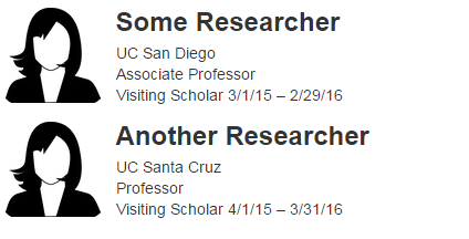
Note: Using the profile template will eliminate this problem. Email wts@ucsd.edu to set up a profile template on your site.
Social media icons
Embed any of these social media icons on a page with the following code:
Medium and large icons
Create medium or large icons by updating the line:
<ul class="social-list">
to one of the following:
<ul class="social-list md-icons">
<ul class="social-list lg-icons">
Medium icons
Large icons
Horizontal icons
Create a horizontal layout by adding
horz-icons
to the class. This can be combined with the icon size, resulting in one of the following:
<ul class="social-list horz-icons">
<ul class="social-list md-icons horz-icons">
<ul class="social-list lg-icons horz-icons">
Standard horizontal icons
Medium horizontal icons
Large horizontal icons
Subhead font
The subhead font is useful for introductory text following a heading.
<p class="subhead">
    The subhead font is useful for introductory text following a heading.
</p>
Horizontal rule:
Horizontal rules can be used to break up content.
<hr width="100%" />
Break (hard return):
You can create a hard return in the WYSIWYG by pressing "shift" + "return".
<br />
Pre-formatted text:
<pre>
    The pre element displays text in a fixed-width font and preserves
    both spaces    and line breaks.
</pre>
Lists:
Use unordered lists for a bulleted list of items. You can nest lists:
- Unordered list item A
- Unordered list item B
- Sub list item B.A
- Sub list item B.B
- Sub list item B.C
- Sub sub list B.C.A
- Sub sub sub list B.C.A.A
- Sub sub sub list B.C.A.B
- Sub sub list B.C.B
- Sub sub list B.C.C
- Sub sub list B.C.A
- Unordered list item C
Use ordered lists when the order is important:
- Ordered list item A
- Ordered list item B
- Sub list item B.A
- Sub list item B.B
- Sub list item B.C
- Sub sub list B.C.A
- Sub sub sub list B.C.A.A
- Sub sub sub list B.C.A.B
- Sub sub list B.C.B
- Sub sub list B.C.C
- Sub sub list B.C.A
- Ordered list item C
Blockquotes:
Blockquotes (pull-quotes) are a great way to highlight citations or quotes from other sources. The blockquote element is useful if your quote is longer than a sentence or two.
<blockquote>
    Blockquotes (pull-quotes) are a great way to highlight citations or quotes from other sources.
    The blockquote element is useful if your quote is longer than a sentence or two.
</blockquote>
Superscripts and subscripts:
Use a superscript or subscript for equations and scientific text.
Use a <sup>superscript</sup> or <sub>subscript</sub> for equations and scientific text.
Opening links in new windows:
We don't recommend launching new windows for links for accessibility reasons. But if you absolutely must:
Link to Google that opens a new window.
<a target="_blank" href="http://www.google.com/">Google</a>
Link to Yahoo that opens a new window with no new window icon.
<a target="_blank" href="http://www.yahoo.com/" class="nonewwin">Yahoo</a>
Messages & Alerts:
Alert:
- Alerts should be used at the top of the page for short term, essential information
- It should not be a permanent feature of your page
- It should contain only the title and one or two lines of text
Alert
This is an alert message.
<div class="msg alert">
    <h2>Alert</h2>
    This is an alert message.
</div>
Messages:
Messages are comprised of notes and call out boxes. They should be used sparingly. The only time messages should be used together is if there is an alert box and then a message box. Messages are not to take the place of regular content and should not be the only content on a page or in a drawer.
Note
This is a information message.
<div class="msg info">
    <h2>Note</h2>
    This is a information message.
</div>
Call out box:
- Use it as a stylistic device to draw attention to part of your content
- It can be a long-term addition to your layout
- It may contain several lines of text
- Larger title
Call out box
Applying class="styled" to a div gives you a box with a different background.
<div class="styled">
<h2>Call out box</h2>
    Applying class="styled" to a div gives you a box with a different background.
</div>
Button Links
Note: Works only in V5 sites.
Using code view, applying class="btn styled-blue" or class="btn styled-yellow" to a link gives you a blue or yellow button.
<a class="btn styled-blue">Blue Button Style Link</a>
<a class="btn styled-yellow">Yellow Button Style Link</a>
Tabs
Note: Works only in V5 sites.
Insert HTML in your WYSIWYG in the source code view.
Make sure to match the aria-controls and href elements of the individual tab item with the id element in its corresponding tab content div. These elements work together by specifying which content is displayed when the specific tab is selected. This will affect tab navigation if they are not matching.
Aria-controls are used to aid with assistive technology. Read more about developing with aria-controls here.
Best Practices:
- Limit to 3-4 tabs. If more content is needed, we recommend separating content into multiple pages.
- Limit tab title length to approximately 3 words. Concise and easy to read tab titles will ease navigation especially on mobile displays. Longer titles may cause tabs to wrap to a new line.
- For multiple sets of tabs on a page (including in separate drawers) make sure each tab has a unique id (tab, tab1, tab2 for one set and tab3, tab4, tab5 for the next set) or the tabs will link back to the initial set.
Content for Tab 1
Lorem ipsum dolor sit amet, consectetur adipisicing elit, sed do eiusmod tempor incididunt ut labore et dolore magna aliqua. Ut enim ad minim veniam, quis nostrud exercitation ullamco laboris nisi ut aliquip ex ea commodo consequat.
Content for Tab 2
Ut enim ad minim veniam, quis nostrud exercitation ullamco laboris nisi ut aliquip ex ea commodo consequat.
Content for Tab 3
Lorem ipsum dolor sit amet, consectetur adipisicing elit, sed do eiusmod tempor incididunt ut labore et dolore magna aliqua.
Content for Tab 4
Ut enim ad minim veniam, quis nostrud exercitation ullamco laboris nisi ut aliquip ex ea commodo consequat. Ut enim ad minim veniam, quis nostrud exercitation ullamco laboris nisi ut aliquip ex ea commodo consequat.
<div class="tabs">
    <!-- Nav tabs -->
    <ul class="nav nav-tabs" role="tablist">
        <li class="active" role="presentation">
            <a aria-controls="tab1" data-toggle="tab" href="#tab1" role="tab">
                Tab Title 1
            </a>
        </li>
        <li role="presentation">
            <a aria-controls="tab2" data-toggle="tab" href="#tab2" role="tab">
                Tab Title 2
            </a>
        </li>
        <li role="presentation">
            <a aria-controls="tab3" data-toggle="tab" href="#tab3" role="tab">
                Tab Title 3
            </a>
        </li>
        <li role="presentation">
            <a aria-controls="tab4" data-toggle="tab" href="#tab4" role="tab">
                Tab Title 4
            </a>
        </li>
    </ul>
    <!-- Tab panes -->
    <div class="tab-content">
        <div class="tab-pane active" id="tab1" role="tabpanel">
            <p>Content for Tab 1</p>
        </div>
        <div class="tab-pane" id="tab2" role="tabpanel">
            <p>Content for Tab 2</p>
        </div>
        <div class="tab-pane" id="tab3" role="tabpanel">
            <p>Content for Tab 3</p>
        </div>
        <div class="tab-pane" id="tab4" role="tabpanel">
            <p>Content for Tab 4</p>
        </div>
    </div>
</div>
Note: Replace "https://addyourlink.com" with the link to your social media account.